This is how you do denial and flagrantly cherry pick data.
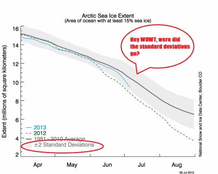
Here is a graph Anthony Watts @ Watts Up With That? (WUWT) elects to use from the National Ice and Snow Data Center:
Notice anything? Anything missing? Anyone?
Would that be the standard deviations (SDs)?
If you remove that pesky piece of information that indicates that sea-ice decline is below average you remove the problem!
Until 2009 the NSIDC used to present the graph without the SDs (hat tip A.Watts!).
If the NSIDC has elected to present information in one format as their preferred means of communication, it is beholden to all of us to follow their model.
That is a reasonable assumption to make. If Mr. Watts is aware they changed this back in 2009, surely his blog needs to mimic their current practice?
Mr. Watts accused me of lacking professionalism. Over to you now Anthony regarding the question of professionalism.
Context matters
If the NSIDC elect to give prominence to the presentation of data in one format it is reasonable to assume we are all beholden to follow their lead.
You could claim they presented their data as such four years ago.
But not now:
Notice anything?
The graph includes the SDs. If you go to their Sea Ice page you’ll see graphs that us the SDs.
So why does this matter?
Because the context in which information is presented matters a great deal in this debate.
And when you exclude something, it is because you may not want it to be seen.
Now it could very well be that Mr. Watts simply needs to bring his images inline with the practices of the NSIDC – if that is the case the opportunity now exits.
We can take data and images from anywhere – from NSIDC, from a government website or the Bureau of Meteorology and present it however we wish.
But what matters more: the thin slice of data you wish to highlight, of the full data set and the contextual information?
Excluding standard deviations in sea-ice graphs @ WUWT: why it matters
You can create the graphs yourself here: http://nsidc.org/arcticseaicenews/charctic-interactive-sea-ice-graph/
You don’t need to Photoshop the image, thus I’ve withdrawn my throw away comment about Photoshop. Which I note was intended to be satirical, but still I felt compelled to remove it to save people’s confusion or spare them a sense of outrage.
Now given:
- the history of denying the link between human activities and climate change at WUWT
- the long running antipathy towards the work of climate scientists at WUWT
My interpretation remains more than reasonable.
To the general public this may seem an obscure debate over the minutiae of graphs and data. But Mr. Watts content makes its way into the mainstream press via blogs such as Andrew Bolt.
Hence my focus on the use or potential misuse of images, data and information.
WUWT is a site that exists to cast doubt on climate change.
Much of the information presented there is crafted to undermine the scientific consensus.
Thus as a true sceptic – not one who merely adorns the garb of the curious – I will continue to question the use and misuse of information on sites such as WUWT.
Over to you Anthony: if you’re calling me out then likewise
Sceptics here have asked that make an amendment to the original version of this post, which I have.
Now it is time for them to acknowledge the information presented in the graphs at WUWT lacks context. Now is the time for them to admit WUWT uses a presentation format four years out of date.
The record of my transparency, openness and honesty is here for the entire world to see and judge.
Now it is time for Anthony to live by the same standards he demands of others and fix his mistake.
Over to you Anthony.


“GISS? They have the most compromised temperature data of them all”
NASA earth Observatory
The GISS methodology is more sensitive to unusual conditions in areas with few temperature stations. Because HadCRU does not extrapolate data to areas where there are no stations it can underestimate the warming effect of climate change in the Arctic, for example.
The rate of Arctic sea ice loss suggests temperatures are higher then currently stated in the HadCRU data. Because temperatures were cool in the Arctic during 1998 the GISS value was lower than that given by HadCRU. During 2005 and 2010 the Arctic experienced warmer conditions and thus GISS gave a higher global temperature than HadCRU. This probably explains why HadCRU states that 1998 is the warmest year on record while GISS states 2005 and 2010 are the warmest years.
Temperature Anomalies
Scientists each year announce the change in global temperature compared to a historic long term average. They describe this as the “temperature anomaly” from a “base” period. We cannot calculate an accurate absolute average temperature. This is because, among many reasons, temperature stations are placed at different altitudes and record data at different times, while some are placed in urban and others in rural areas. Using anomalies allows scientists to extrapolate data across geographical regions more accurately.
GISS, HadCRU and the NCDC each use different base periods: GISS uses 1951-80, HadCRU uses 1961-90 and NCDC uses the whole of the 20th Century. This means that each organisation’s annual figures are different.
However, the annual changes in temperature recorded by the different organisations are very similar.